Admin Navigation Redesign
We had a complex set of products tied together with one navigation bar across two codebases - one for on-premise software, and one that was cloud-based. Technically there were two implementations of the navigation, but they looked approximately the same. The company was working on building out a third codebase with new, new-generation stuff and a complete overhaul of the visual design. The existing navigation already included an admin section, and we were going to need to build new pages into that as part of that third codebase.
Goals #
- Solve the existing problem of having a navigation structure that didn't serve most of our users
- Provide a layout that would allow us to grow and evolve easily
- Ensure it could be implemented with the existing data structure used to serve up the existing menu
- Figure out how to handle admin navigation - we were adding some pages to
My Role #
I was put onto this project after a lot of exploratory research had been done about the efficiacy of our navigation. The team had already determined our existing navigation wasn't serving our users. I was part of a new project that needed to eventually integrate (somewhat) holistically with the rest of the platform. I had to figure out what that would look like.
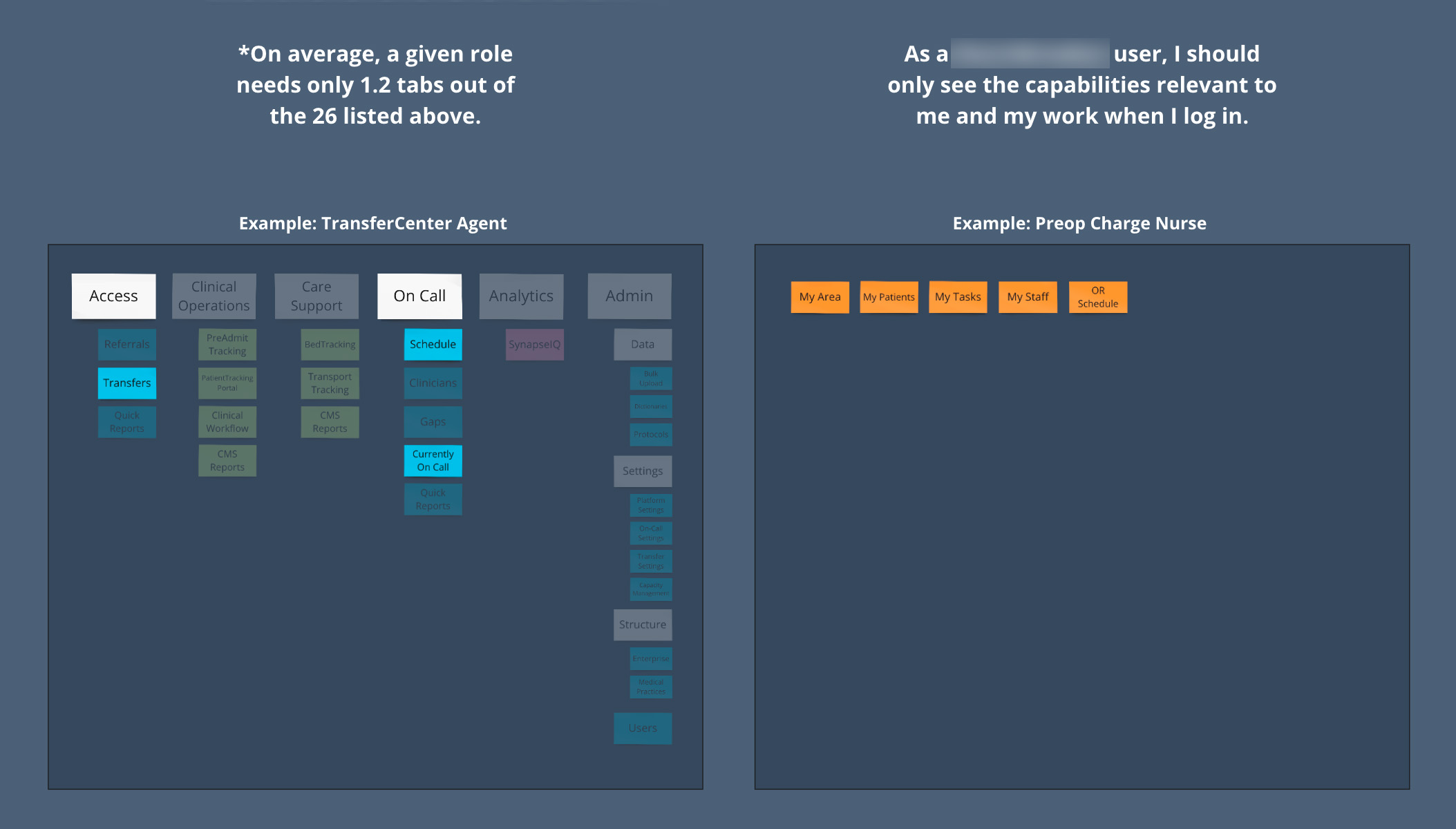
So the typical experience was far from ideal. The first thing I did was work through the basic navigation structure. For our end users it was clear that the simplest option would be to have direct access to the pages they needed, not the high level categories.
First up spent some time with the cards, looking at categorization options and thinking things through. Early on I also talked with a group of engineers who were working out some of the technical constraints and figuring out how they were going to integrate the nav. This was crucial because there were for sure going to be some technical limitations, and I wanted to understand what our options were.
Then I worked through some very rough wireframes. For the primary nav, I couldn't justify spending much time on a mobile option since the strategy for these applications is to build custom mobile apps where they're needed, but I did want to make sure we had options long term just in case.
Part of this was also settling on the best way to improve usability of admin settings. Lots and lots of pages, and navigating between them was a giant pain in the current navigation. Wanted to move towards a secondary navigation for all of admin, with links that were easibilty available.
Once I had settled on a feasible nav option and had talked with others, I wanted to test out and get feedback. It's tough to get time with our subject matter experts and consultants, so I opted to combine some exploratory questions with directly navigating through a prototype to see if they could find things.