Back Office Redesign
The business was launching a new and improved compensation plan for their direct sales representatives (known as "ambassadors"). The existing back office dashboard and reports (totaling twelve pages) needed updating to reflect this new plan. The plan was finalized at the end of September 2017 with a publicized launch date of January 1, giving us almost three months to complete research, design, development, and testing.
Goals #
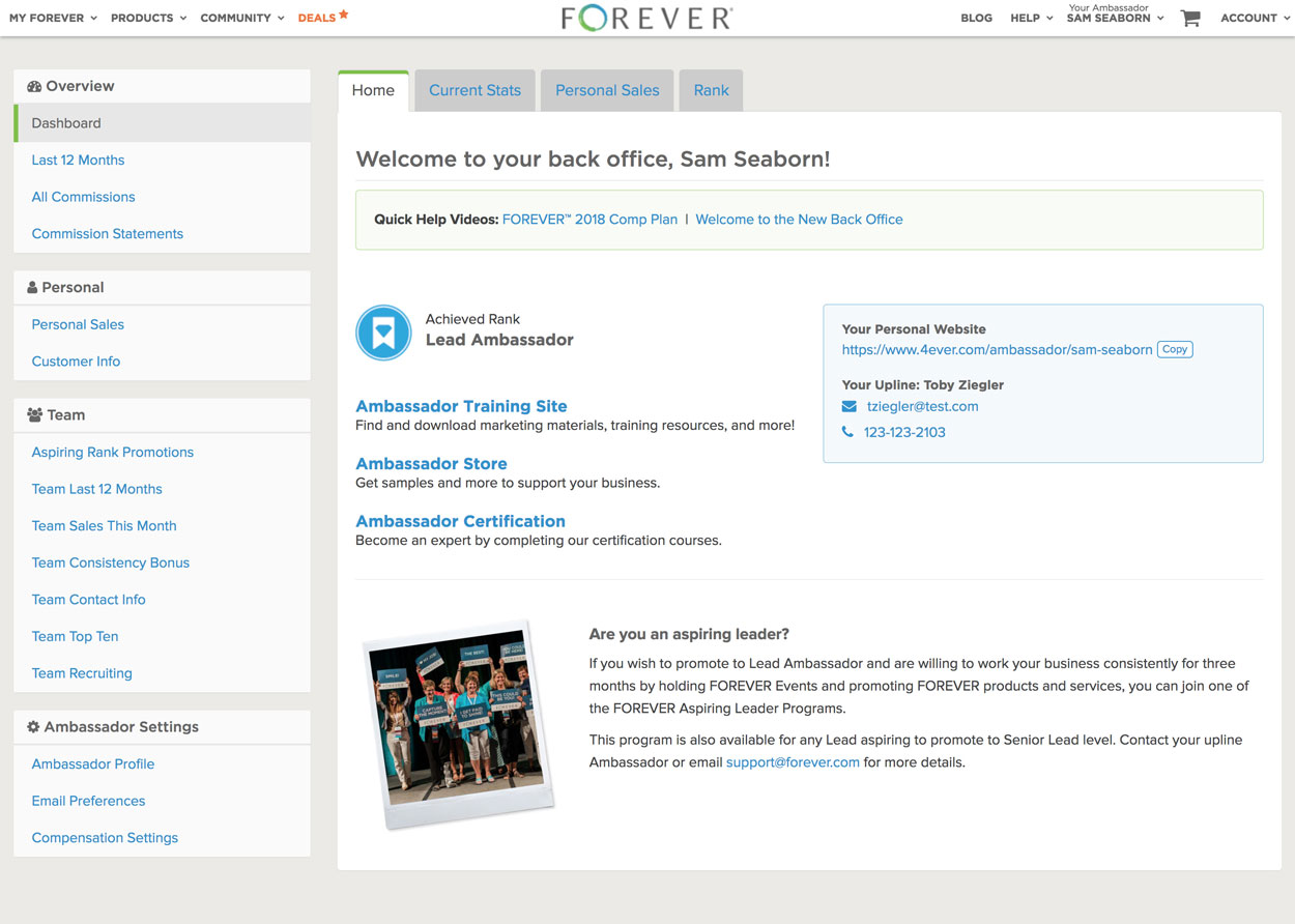
The primary goal from the business, given the timeline and resources available, was simply to update the dashboard and existing reports to accommodate the new compensation plan (this would involve adding some new pages as well) and make it as easy to understand as possible. After conducting exploratory user research on the effectiveness of the existing back office, I identified a number of other enhancements we could aim for:
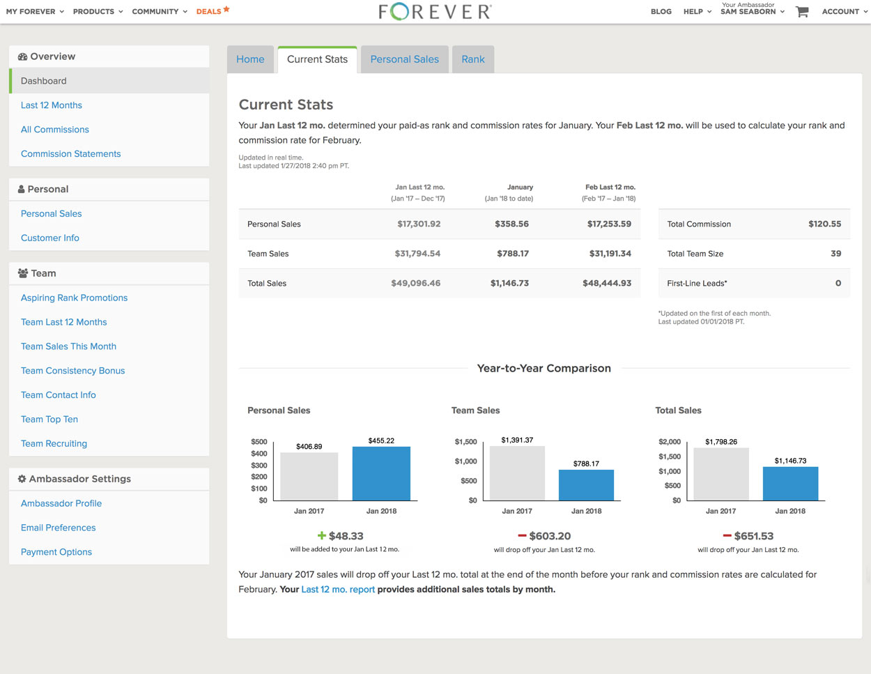
- Use bar graphs to present more information clearly at a glance
- Update existing report filters and defaults to ensure consistency and save ambassadors time
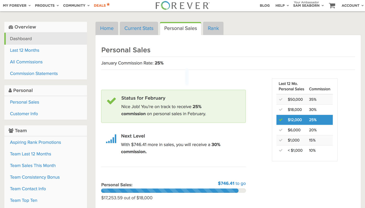
- Update the information we display in existing reports to provide more useful information
- Provide more conditional messaging and encouragement to ambassadors to add clarity and keep them motivated
- Reorganize navigation to make it easier to find important links, and enable ambassadors to visit their training site without showing private financial information.
- Provide automatic tracking of an exclusive bonus to reduce manual accounting work
- Improve internal sales team reporting to allow them to access information more efficiently
My Role #
I functioned primarily as a project manager & lead designer while also building much of the front-end structure and Rails-based logic for new dashboard screens. I conducted initial user and stakeholder interviews, organized user testing sessions, designed and helped implement new back office pages and updated reports, and coordinated with two developers and a junior designer who were also working on the project. Towards the end, as my time needed to be dedicated more towards implementation, I coordinated with another project manager and the sales team to finish up final user testing, socialization, and QA testing.
Results #
We were able to over-deliver. Not only did we hit the primary business objective of accommodating the new plan, we also added a fourth new report to provide much-needed promotion-related information and hit every stretch goal except the internal report enhancements, which were easy to add after the launch.
From a process perspective, we also succeeded in pushing for a rougher, earlier implementation and refined front-end visuals in the browser. This enabled us to begin internal testing a full month before the deadline which was vital to the successful launch.